

A Flutter screen can fit on a developer's phone and still hide its primary action when someone increases the system font size. Shrinking the text or disabling scaling may conceal the layout failure while making the interface harder to read for the person who needs larger text.
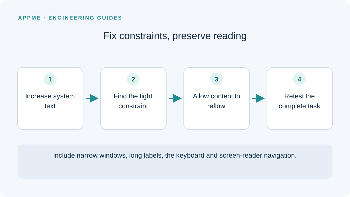
Respect the system preference, identify the constraint causing overflow, and let the arrangement change when content needs more room. Test with real operating-system settings rather than treating a zoomed screenshot as equivalent evidence.
Why a taller fixed box is not a complete fix
A row containing an icon, title, description and action can run out of width as well as height. Increasing one fixed height may accommodate a particular label but fail with a longer translation, a narrow window or an open keyboard.
Flutter's accessibility guidance explains that text widgets respect system font settings and layouts need space for the resulting content. Its text-scaling guidance also describes TextScaler for behavior that should not be reduced to a single linear multiplier.
Inspect constraints before changing typography
Imagine a lesson card with a long title, duration and a Continue practice button. At a large font setting, the button pushes the title beyond the available width. First identify which widget forces a single row and which ancestor fixes the available height.
| Symptom | Inspect | Change to evaluate |
|---|---|---|
| Horizontal RenderFlex overflow | Children of Row and available width | Flexible text area or a stacked arrangement |
| Vertically clipped text | Fixed-height ancestor | Height determined by content |
| Partially hidden button label | Line limits and padding | Wrapping label or separate action row |
| Keyboard covers the action | Remaining viewport and scrolling | Reachable action after the keyboard opens |
Change one constraint, repeat the failing scenario and record the result. Replacing several controls at once makes it harder to establish which change solved the actual problem.
Give the action its own space
This minimal Dart example demonstrates one part of a card. The title, description and callback are supplied by the surrounding screen. It is a starting arrangement, not an automatic breakpoint strategy for every product.
Column(
  crossAxisAlignment: CrossAxisAlignment.stretch,
  mainAxisSize: MainAxisSize.min,
  children: [
    Text(lessonTitle),
    const SizedBox(height: 12),
    Text(lessonDescription),
    const SizedBox(height: 16),
    FilledButton(
      onPressed: onContinue,
      child: const Text('Continue practice'),
    ),
  ],
)
Check the parent when integrating it. A flexible Column still gets clipped inside a fixed-height box. In a scrolling list, verify how each item measures itself and whether focus remains predictable when the item's height changes.
If a compact horizontal layout remains useful on wider windows, establish an explicit condition for changing the arrangement. Base that decision on available space and content requirements rather than a particular phone model name.
Build a reproducible font-size matrix
Choose a narrow display and a wider display. Test the default setting, an increased setting and the largest supported system setting. Flutter recommends large-font testing; its Android nonlinear-scaling migration guidance specifically discusses testing at 200%.
Add long labels, validation errors and a language with longer strings. Repeat with the keyboard open. The acceptance condition is that someone can complete the task, not simply that a screenshot contains no overflow stripes.
For each failure, retain window dimensions, font settings, the Flutter version and the exact string. A fix verified only with a shortened test label does not establish that the product content works.
Verify interaction as well as visibility
A fully visible label is only one part of usability. Check screen-reader names, focus order and whether returning from a dialog restores a useful position. Do not make an important state understandable only through color.
An illustrative acceptance record for the lesson card might require the full title to remain available, the action to be reachable without horizontal scrolling and the selected lesson to survive a layout change. These are proposed checks, not measured results from a shipped application.
Add the failing case to your release-readiness review, then inspect other cards sharing the same layout pattern. For broader architecture decisions, see the native versus cross-platform framework guide.
Frequently asked questions
Should every title use an ellipsis?
Only when hiding the remainder does not prevent someone from distinguishing an option or completing the task. Important reading content may need more lines or an explicit way to open the full text.
Can I disable scaling across the app to eliminate overflow?
That avoids the layout problem by removing a user's reading preference. First address the constraints and arrangement at the failing location, particularly in products intended to support large text.
Primary sources
Check these original references again before making a release or policy decision.